6 Lessons in Excellent User Experience Design from AachabOnline

 No design is perfect; there will
always be something for people to complain about, or user
experience (UX) designers to debate. But I cannot help but smile
when I see smart local designs where you can see that some thought
has been put into the UX.
No design is perfect; there will
always be something for people to complain about, or user
experience (UX) designers to debate. But I cannot help but smile
when I see smart local designs where you can see that some thought
has been put into the UX.
A friend shared a link a few weeks back for AachabOnline, an online shop for herbal products and sweets, from the Middle East, stressing that it’s only soft-launched and is still in beta.
Personally, the only two things I don’t shop for online are clothes and food, for the obvious reasons. But, since the website is selling some of the stuff that I love (Hey! Saffron is great in some dishes and sauce salads! And who doesn’t love Mann & Salwa sweets?!) I took the plunge and checked it out.
Impressions from the journey:
AachabOnline: the domain name says it all. Herbs in Arabic. And I was greeted with a design that has a Lebanese touch to it.
A carousel displaying different messages has all of the information there. I couldn't complain except to note that some announcements don't offer extra information (i.e. you can’t click on it), and you can't navigate through the carousel, you will have to wait for the slide to play again.
I immediately scrolled down looking for “Easter eggs,” and I wasn't disappointed here a bit: right before I hit the footer, the site offered a strong reinforcement of the store’s legitimacy: a physical address for the shop and a phone number. I wasn’t worried anymore as to how to contact them if anything goes wrong. It's key to work on gaining trust when designing an online shop, that's essential in the UX process.

My trust was reinforced again when I noticed that the shopping and payment mechanism was clearly secured with SSL. With a good user interface, a physical address, and a secure site, it’s safe for me to continue; I am not hesitant anymore.
Moving on, I started browsing for products and found my Saffron and Mann and Salwa. I click the button to add, hoping I won't be taken to a "confirmation" page, and I couldn't help it but smile at the message I got while it was adding the item: "Yalla, one sec…". And to my surprise, the basket on a rope slid all the way up with a notification about the item in my basket and the total of my cart! Beautiful, non-intrusive, and most importantly no confirmation page taking you back and forth!

A simple click on the basket, and you get details of your order, and you can update the amount you are ordering. The only downside is that if you want to check the information of the product you just ordered, they don’t provide you with a direct link, you will have to go back to the category where it was to read the info. Again, it’s in beta.
I wanted to give the search a run, so I entered my query, hit enter, and I got a beautiful product listing, with images of the products and options to add them immediately to the basket! No ugly text listings, no mazes to add the product. Simple and direct!

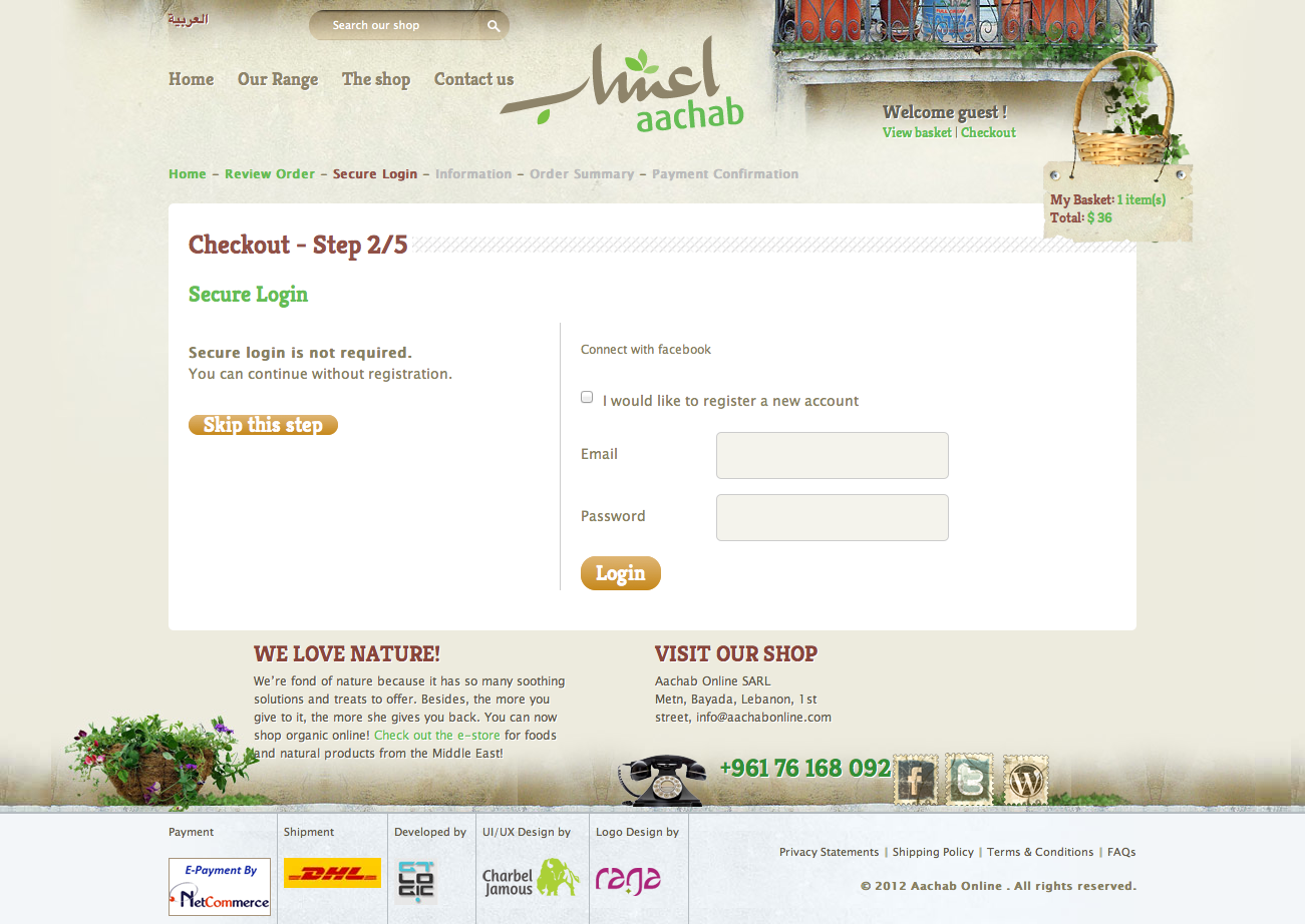
When it came time to checkout, I couldn’t believe it when I saw this screen. I can checkout without having to sign up for anything! Express checkout! I am in heaven! And to top it all, there was a visual indicator of the following steps. Smooth, and easy, with no complications.
So, here are the takeaway lessons, a few things that Aachab did right:
- Build trust. I can’t stress this enough.
- Users are more likely to buy from a NON SECURE but
WELL-DESIGNED shop then a secure but badly designed shop.
Fortunately here, it’s a non-issue; Aachab has both.
- Give customers a legitimate physical address where they can
contact you.
- Always offer an express checkout. Users will give you their
information sooner or later.
- Always offer a visual indicator of the steps involved and
progress during the checkout process.
- Work on your search engine, and most importantly your search result page. This will help customers find what they need.
Conclusion? Would I buy from there? Why not! It satisfies prime points for me, and it didn’t leave me frustrated. I highly recommend that you go there and check out its UX. It’s a solid start!

