How to optimize your marketing emails for mobile

Managing email is already difficult for most users these days, who
often open up their email only to find that, of a dozen new
messages, nine are spam or irrelevant. Getting your company's
message through the noise is difficult, even more so on mobile,
which is swiftly becoming a preferred method for using
email.
In the Middle East, it's even more clear that it's essential to
optimize communications for mobile; over 60% of the population in
Saudi Arabia, and 62% in the UAE report owning smartphones. Yet e-marketing
mistakes are still widespread, costing companies vital conversions
and revenue. Below are a couple of simple, straightforward tips to
optimize e-mail marketing for mobile platforms.
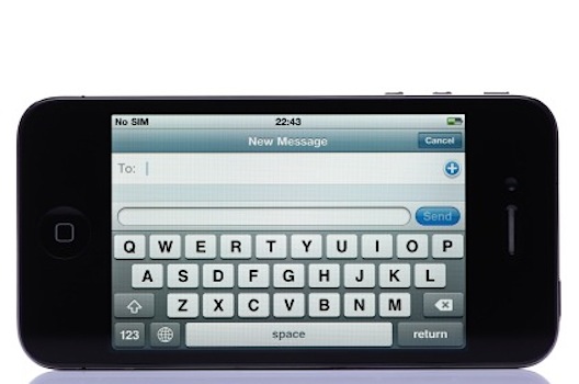
1. The five stages of mobile email viewing
Unlike in conventional e-mail marketing, mobile e-marketing funnels the reader through five stages.
- From line: Unlike on computer-based email
exchanges such as Outlook, on a mobile phone, users will most
likely not be able to see a preview of the email. Mobile phone
users care about who sent the email. If the reader doesn’t know you
or isn't interested, they could delete the email or mark you as
spam. To avoid this, keep the "from" line simple and clear.
- Subject line: Secondly, there’s the
subject line. Many mobile email clients will showcase a subject
line underneath the from line, but the number of characters on a
mobile email will be limited to 35 characters. Keep your subject
line simple, to the point, and less than 35 characters.
- Preview pane and preheader: A number of
mobile email clients will allow users to preview a small part of
the email’s text. Put your call to action in the preview pane, to
entice the reader and push them to open the email. You’ll only have
85 characters or less though, so make the preheader as compelling
as possible.
- Viewport: Once the viewer has opened the
email, they’re only going to see a portion of your message if
they’re using their mobile. You need to ensure that the most
important parts of your message are in the viewport, up front and
center of the screen. You can use tools and designs to pull the
user down, such as images and background colouring or bullet
points. But if they leave the email at this point you want to make
sure they've already received the message.
- Scrolling view: Now that the reader has seen the top portion of the message, the final stage of viewing is getting him or her to scroll down and read the complete message. Here, keep your text clean and simple, and ensure that your call to action is large, well displayed and simple enough for the reader to follow.
2. Tap and swipe only
Smartphones are tap and swipe. Forget the clicks, the keyboards. As many of us with fat fingers know, tapping and swiping on small mobile screen isn’t so easy. A couple of things to bear in mind are:
- Ensure that your buttons are at least 44 pixels square for easy tapping.
- Keep your links and buttons to the center or left of the screen for ease of use.
- Separate links so users don’t accidentally tap more than one at the same time.
- Avoid interactive user interface elements such as hovers.
- Whatever you do, avoid the phrase "click here" on your mobile-optimized emails. Remember, mobile users are tapping.
3. Optimize your layout and graphics
This may seem very obvious, but it's important to adapt your layout and graphics to the size of a mobile screen. In mobile, messages are scaled down, so go for a single-column layout rather than multiple columns. Use large text sizes and make use of contrast to increase legibility (but don’t overdo it). Make your buttons extra large, so that they’re easy to tap, and consider adding some texture to make the buttons more appealing as well. Finally, don’t forget to use large photos and images that will still look great when optimized for mobile e-marketing.
4. Use responsive design
Responsive design is a technique that can make your job much easier, as it enables the the message to resize itself according to the device being used. This will dramatically cut your design times and reduce the costs needed to develop effective e-marketing campaigns. Most importantly, you won’t miss out on a potential lead by not properly rendering e-mails on a specific device. If you’re not already doing it, go responsive.
Instead of forgetting one of the fastest growing target customer
segments out there today, give spam the chop and start properly
tailoring marketing for a mobile audience. You may be surprised how
much mobile marketing promotes your brand, drives engagement and
boosts revenues.

